This post first appeared on www.vickiwenderlich.com
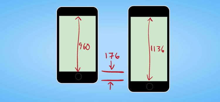
The iPhone 5 introduced a longer screen: the same width, but with an extra 176 pixels in height.
Most users seem to appreciate the extra space, but it poses a design challenge for app makers: how do you create a background for the different iPhones?
Note that we are talking about the iPhone retina and the iPhone 5 – the older unretina phones have screen sizes that are simply half that of the iPhone retina.
Here are four ways you can design for the longer iPhone 5 screen:
1. Different Art Entirely
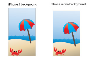
The obvious first option: use different pieces of art!
If your background is heavily illustrated or needs to be the exact size of the screen (for example, if you have borders or a scene, like in a game), you will need to make two different backgrounds sized for the two different screens.
Pros:
- best customization
- can create an illustrated scene or richly textured components
Cons:
- uses up the most memory
- have to create more art (which equates to a higher cost for the designer)
2. A single long background
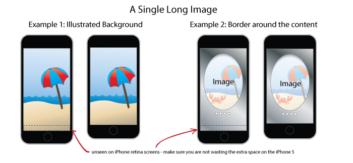
Many app developers are using a single background that is sized for the iPhone 5, with the intention that it hangs off the top and bottom of the iPhone retina screens.
Pros:
- you can customize your background more than with the following options
- uses less memory than having two separate images
Cons:
- part of the image won’t be seen on iPhone retina screens (which may or may not be an issue with your app), or you might be wasting that extra space on the iPhone 5.
3. A repeating background
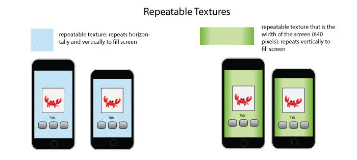
This is the second most versatile background, if it works for your app. Create a repeatable texture that will fill whatever size screen is used. This way it doesn’t matter whether the app is in portrait or landscape mode, or if it’s an iPhone retina or an iPhone 5 (or even an iPad, if it can repeat horizontally).
Pros:
- simple to create (or find for free, just search “free repeatable backgrounds”)
- uses small amount of memory
- can expand to any screen size
Cons:
- none – if this type of background suits your app, you are in luck!
4. A repeating background with end caps
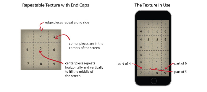
This is the most versatile background, but a little tricky to create. It is basically a repeatable texture in the center, with specified pixels on the sides and corners that do not repeat.
Pros:
- can adapt to any screen size
- looks better than a plain repeatable image since the edges can be different.
Cons:
- harder to create
- textures can sometimes look funny where they meet; works best with simple textures like noise or “paper” rather than complicated textures like wood grain
5. A Safe Zone
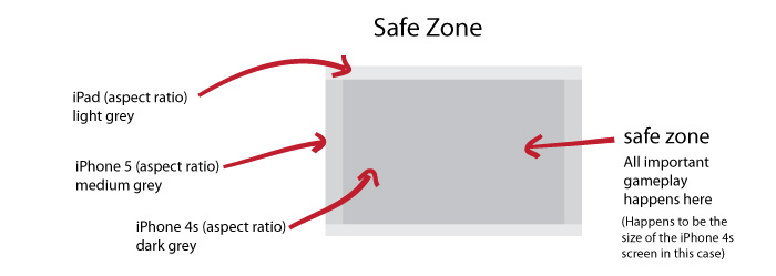
Make a large background that looks fine on all devices when centered. Then define a “safe zone” that is available on all devices you are developing for. It’s generally good to use an aspect ratio of 4:3. Design your game so that all the important stuff is within that safe zone (or design the game so that users with larger screens do not have an advantage).
Pros:
- One image to rule them all! You don’t have to create individual images for every single device.
Cons:
- Must design important features to be within safe zone – this means you aren’t using the whole screen of most devices.
Which To Choose?
The type of background you choose will depend on the type of app you are creating.
If you are creating a game, you will probably go with either option 1, 2, or 5.
If you are creating a utility app with a clean or quiet design, you will go with option 3 or 4.
If you are creating an app with rich textures or important visual aspects (like if you are making your app look like an old-school radio, or a notebook), you will probably go with option 1 or 2.
Developers: if you have another way of dealing with the two different screen lengths, let us know in the comments!


Nice tips!
But I think you miss an obvious one. You can also just stretch the image in some cases. For me (a developer) that would be the easiest to implement.
True, if you can just stretch the background without it looking bad, that is a great easy solution!
There is a bit more painful way to resolve the new iPhone’s greater height. I would try to rescale the image before sending it to the screen respecting the aspect ratio of the image. So I would change both width and height of the image accordingly.
Hi Vicki,
thanks for the tutorial – well made like always and easy to understand thanks to the good images.
In our games we used a slightly different approach: we make the background image larger around all edges (if the background is centered in the middle of the screen), so it looks fine on all kind of devices and aspect ratios. With this approach, you can use the same images for iPhone4/4S and iPad1/2 and as well the iPhone 5. And we can also support Android devices which would otherwise be a major challenge due to the many screen resolutions.
In the game logic, we define a “safe zone” which is available on all devices and has a aspect ratio of 4:3 (like the iPhone1-4S). The reason for choosing a 4:3 as the safe zone, is that it is in the middle of the other 2 extreme ratioss: 3:2 and 16:9. Thanks to the larger background we can then support a 3:2 (iPad) and 16:9 (almost iPhone5) ratio.
I did write my own tutorial about this topic on our site: http://doc.v-play.net/beta/vplay-different-screen-sizes.html
I would love to hear your thoughts about this approach!
That’s a great idea, especially with how it works with non-iOS devices too. We have done something similar (well, just with iPhone and iPad, not Android yet) with one of our apps and it works pretty well.
The only problem with “safe zones” is that you end up wasting some space on different devices (which is why Apple doesn’t really approve of this method – they like each app to be optimized for each device), but it definitely makes development a lot easier since you don’t have to redesign for every single device.
It depends on the game if you can use the safe zone or not. You could design the game so the players with a different aspect ratio do not have an unfair advantage. E.g. on a side-scroller to display more of the already discovered world on the left when moving left-to-right, but not to the right (undiscovered) side. However, in some game types you just can’t do that :(
So I think it is a trade-off, to not have 100% comparable highscores on devices with different aspect ratios, but maybe a tiny advantage for those not on 4:3 ratio. And if you find out players on different ratios score too differently, you could multiply the score with a factor to make it even again.
Another point that comes in my mind regarding the screen wasting: we did position our GUI elements like the HUD elements in the tutorial relative to the screen and not to the safe zone. So the player won’t recognize he’s playing a slightly different version than others.
The safe zone approach is also what we used in our upcoming math game, TractorMath (releasing next Friday!). Our game is not a competitive sort of game, so there really wasn’t any disadvantage to going this route – the animated items are just all placed in the safe zone. In Illustrator, I created a symbol for each game background, and placed it on three different artboards – one for each unique aspect ratio (iPad, pre-iPhone-5, iPhone-5). I use TexturePacker to resample the spritesheets to half resolution for the iPad 1&2, and the iPhone 3GS/iPod touch 3rd Gen.
I went with number 2. Made the backgrounds longer for iPhone 5 and other iPhones miss some off.
Dave
Thanks for the tutorial… It was informative. I liked the section “A repeating background with end caps”
WOW # 2 is the best idea! Its a simple, but awesome one :) thanks so much!!!!
Thanks for these great tips. The last one seems good for me.