Illustrator, Tutorials
Illustrator Tutorial: Basic Backgrounds
This post first appeared on www.vickiwenderlich.com.
Program: Illustrator CS4
Skill Level: Beginner
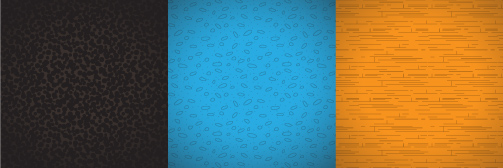
Backgrounds are important: they set the stage for your app. Without a good background, the rest of your app cannot shine.
The tricky thing about backgrounds, however, is that they need to be subtle but not boring, which is not as easy as it sounds.

Take a look at some apps you think are really attractive (or check out this list). Pay close attention the the backgrounds – they don’t distract from the content, but they are not a plain color.”But those are made by professionals”, you say. How am I supposed to make something like that for my app?
You can. You might not be the Michelangelo of the digital world, but by the end of this tutorial, you will definitely be able to put together a functional, attractive background.
I’ve had to make a lot of backgrounds for our own apps as well as Ray’s tutorial projects. Through trial and error and some panicked scouring of the internet for clues, I have learned the key ingredients to solid, attractive backgrounds (maybe if I’d gone to art school they would have taught me!).
The key ingredients of a good background are:
Base Color + Gradient Overlay + Texture
It’s as simple as that.
We are going to make the background that you see here, in the title screen for Mole Whack. This tutorial doesn’t cover title text or cute mole character – just the background.

1. Create your artboard
Open a new document and choose your artboard size. For iPad, this is 1024×768 pixels. iPhone retina is 640×960. I made this one for the iPad, so I used 1024×768.
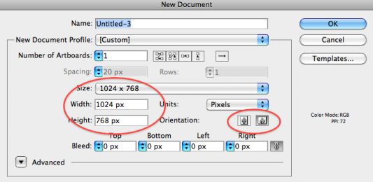
Note the landscape and portrait orientation icons on the right. That’s just an easy way to switch the width and height without having to retype them.
2. Make a rectangle with a color fill.
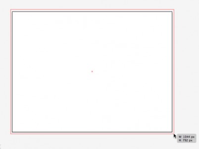
Press M to choose the Rectangle tool (or select it from the toolbar). Click and drag to create a rectangle.Make the rectangle bigger than your artboard.
This is because when Illustrator saves the artboard as a PNG or JPEG, it sometimes is off by a half a pixel (they fixed this in CS5).
If you make the rectangle the same size as your artboard, you will get a transparent edge on one or two sides. I get around this by simply making the rectangle bigger than my artboard.
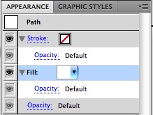
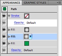
Give the rectangle a green fill by selecting the fill in the Appearance panel…
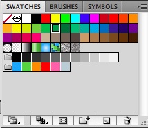
…and then clicking one of the green swatches in the Swatches panel.
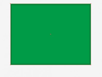
This is your background so far.
It’s boring right now– but don’t worry, we’re about to jazz it up!
3. Add a gradient fade fill
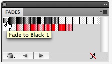
There are several ways to create gradients, but I like to choose a base color and add a gradient fade (a gradient that goes from a color with 100% opacity to the same color with 0% opacity) on top.
This way, I add shading while keeping my options open for future changes.
And there are always changes!
For example, on this background if I decide to change the gradient to shades of red, all I have to do is change the base color fill rather than painstakingly change each gradient color stop. You’ll see this in action later.
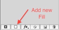
Click “Add new fill” at the bottom of the Appearance panel.
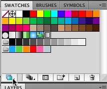
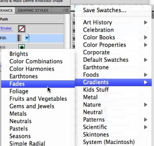
Open the Swatch Libraries dropdown menu…
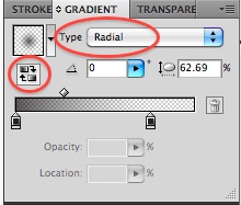
Change the gradient Type to Radial, and click the Reverse Gradient icon.
This gives you a ring where the outer edge is dark and the center of the circle is transparent.
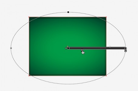
Type “G” to bring up the Gradient Annotator on your rectangle.
Drag the black diamond to increase the size of the gradient; drag the black circle (at the top of the dotted perimeter oval) to make the ellipse thinner or fatter.
Drag the innermost gradient stop over to the right so that the oval has a larger area of transparency in the middle.
4. Add a texture fill
Adding a texture or pattern creates visual interest that makes the background read as “real” to our eyes rather than flat and boring. Illustrator has a built-in set of texture patterns that, being vectors, can scale up or down infinitely without losing crispness. We will be using one of these texture patterns.
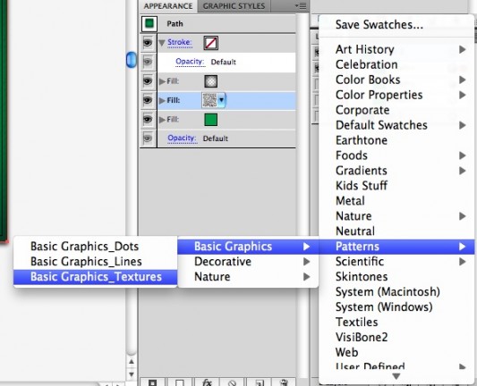
Go to the Swatch Libraries icon again, and choose Patterns > Basic Graphics > Basic Graphics_Textures.
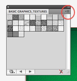
I don’t know about you, but those thumbnails are way too small for me to make out any detail.
Go to the dropdown arrow in the upper right and choose Large Thumbnail View.
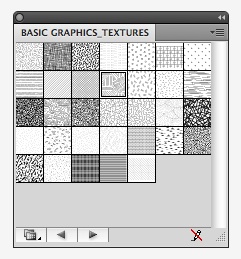
That’s as large as they get. I usually just start clicking them to try them out. For this background, I chose “USGS 21 Intricate Surface”.
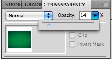
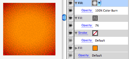
Now lower the opacity. Make sure the pattern fill is still selected in the Appearance palette, then go up to the Transparency tab and lower the opacity to 14%.
The key to texture patterns is subtlety. You want them to contribute to a nice background, not be a visual distraction to the main event.
Here’s the background so far:

Almost done!
Enlarge The Texture
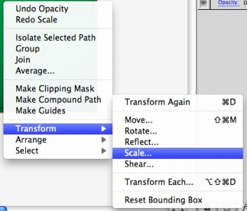
For this background, I decided that the texture needed to be bigger. You can scale patterns themselves (rather than the object along with the pattern), which is very useful.Right click on the rectangle. Select Transform > Scale.
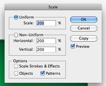
Uncheck every box except “Patterns”.Enter a percentage you want the pattern enlarged. I wanted to double it so I input 200%.
If you want to shrink it, enter a percentage less than 100.
Click Preview to see the effect before committing. If you like it, click OK.

If you want another color, change the bottom fill: Select the solid color fill in the Appearance palette, and then click a new swatch from the Swatches panel. Alternatively, you can click the dropdown arrow next to the solid color fill’s thumbnail in the Appearance palette, and either select a swatch or use the color mixer in the window that opens.If you want another texture, change the texture fill. I created the dirt background image for Mole Whack by changing the base color to brown and the texture to Mezzotint Dot (result shown below left).
All of the following options were created in seconds:

Tips and Alternatives:
- Try some premade gradients.
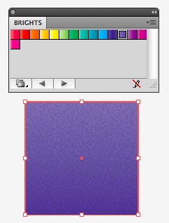
Try out (and tweak) some premade gradients If you don’t like the look that the gradient fade fills give you, try some of Illustrator’s gradient swatches.Find them by clicking the Swatch Library icon and go to Gradients > Brights.
Cycle through them by clicking the right and left arrows.
This is an easy and fast way to get a gradient that you can then tweak to fit your needs.
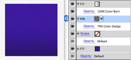
The example to the left has the purple gradient shown, with the Mezzotint Dot pattern on top at 11% opacity.
- Try a Linear Gradient Fade

Left: radial Fade to Black – Center: linear Fade to Black – Right: linear Fade to Center Black Make your gradient fade linear (go to the Gradient tab and change the Type from Radial to Linear).Try different fades, like Fade to Center Black. Type G to bring up the gradient annotator so that you can tweak the gradient directly.
- Try different blending modes
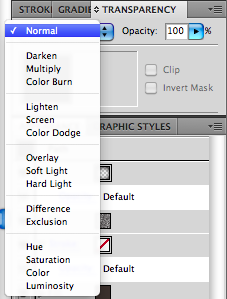
Find the Blending Modes in the Transparency tab. Try out different blending modes for your gradient fade fill and your pattern fill. Make sure to select the specific fill in the Appearance palette before changing its Blending Mode in the Transparency tab.
So what are you waiting for? Go make yourself some backgrounds!
If you have another tip for easy, nice background effects, share them in the comments!



Thanks so much for sharing. I’m slowly building my illustrator skillset by reading your tutorials. I don’t have much yet but I am getting a better understanding of how the tools work together to produce powerful results. I can’t wait for more of these!
Awesome Tutorial, your family is a blessing for all of us. I’ve learned so much from your husband, now you teach me too! Thanks for the effort and dedication!
Thanks a looot again. :)
Like cruz said “your family is a blessing for all of us”
As a coder who struggles with design, I thank you, this is just awesome.
Excellent tutorial, Vicki..! Pls keep up the good work. My best wishes..!
I second Jake’s comment. As a developer, it’s hard to visualize the design side of a complete, visually attractive application. You make it almost look easy and painless, two things I know it’s not, especially when I’ve spent weeks looking for this exact information.
Thank you
I’m glad the knowledge I’ve picked up along the way has helped you! It’s certainly not easy and painless, you’ve got that right, but it’s also not beyond anyone’s ability to design an app – so if these tutorials help, I’m very happy :]
Thank you so much this tutorial, very easy to follow and really really helpful. Thank you again Vicki Wenderlich. Please email me on any new tutorial.
Wow!
Thank you, I´ve learned so much of you. This was really helpful :)
I can’t believe how easy this is! I instantly replicated the Mole Whack background without any problems and I’m going to try my hand at some other backgrounds.
Thanks, this was really helpful.
Great tutorial Vicki. This is exactly what I was looking for and your instructions were perfect.
Thanks for the post.
This tutorial has been SOOO helpful to me. Thank you so much for sharing how to do this so easily.
Really Awesome Tuts by Wenderlich family.
Hats off …
I learned game development from Ray and now learning designing from Vicki because they are really good.
Thank You! You’ve helped me so much with your tutorials, I can’t thank you enough. Wishing you and your family the best!!!!