Game Design, Tutorials
How To Make Game Art With A Distinctive Style
This post first appeared on www.vickiwenderlich.com.
I’ve gotten a couple of questions along the lines of “How do I make art like (X game or Y game) has?” What people really want to know is “How do I make my game art look good and stand out?”
You don’t want to have a clone of a successful game. No matter what you do, it will simply feel like a knockoff (not to mention the copyright issues). However, good games often have a distinctive, appealing style that many gamemakers want to emulate.
What you need to do is create your own look, and the best way to do that is to find artwork that appeals to you and figure out what makes the artwork so good. Then you combine the features you like into new art style.
Here’s how to develop a cohesive, distinctive style for your game:
First: collect screenshots of games with art you adore.
It doesn’t have to be an iPhone game. Flash games, cartoons, websites, pretty much anything that catches your eye and has something about it that fits your game.
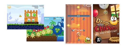
Second: analyze what your screenshots have in common
A specific style will have concrete aspects about it that give it it’s characteristic flavor. When you can identify what those things are, you can start incorporating them into your own art.
Things to look at:
- Strokes
- Are they used? How thick?
- Are they a constant width, or irregular?
- How does the stroke color compare with the object color (darker, lighter, less saturated, or more)?
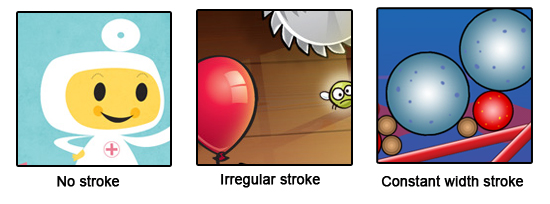
Pictured: Toca Doctor, Drop The Chicken, and Blobster
- Shapes
- Are characters created by combining basic, recognizable shapes like ovals and rectangles, or are they organic and irregular?
- Do the shapes have sharp corners and straight lines, or rounded corners and curves?
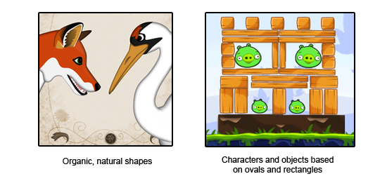
Pictured: Wild Fables and Angry Birds
- Colors
- What is the overall color scheme of the game: bright, dark, pastel, monochromatic?
- What is the “mood” of the game: eerie, playful, elegant? How do the colors contribute to that mood?
- How do the background colors compare to the foreground colors?
- How are gradients used?
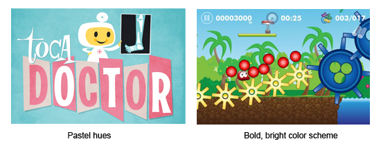
Pictured: Toca Doctor and Blobster
- Characters:
- What are their expressions like? Goofy, mean, realistic, etc.
- Are their features in general oversized, or undersized? Big eyes, tiny feet?
- Are the heads, bodies, and appendages separate, or combined? Do they even have bodies, or just oversized heads?
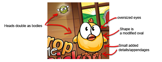
Source: Drop The Chicken
Third: Choose which features to include in your game’s art style.
You probably won’t want to do everything exactly the way they do, so pick and choose which features you will put into your art. A bold color scheme? Oversized eyeballs and cute, ball-shaped characters? No gradients and a thick stroke?
A couple of tips:
Strokes are your friend.
Almost every good art style will use strokes (I said ALMOST! TocaBoca doesn’t use any and they have a cute, clean style). They define the edges of a form, and the shape they take will contribute to the feel of the app.
Be Consistent
Choose a set of rules for your art. It matters less what the rules are than that you stick to them. A cohesive set of art will naturally look better than art with mismatched styles.
Choose a single stroke style, and use it on everything. There’s nothing wrong with a basic 1 or 2 pixel stroke of a darker shade than the inside of the object. Choose a color scheme; tools like Color Scheme Designer or Kuler can help. Decide how you will compose your characters and objects, and use the same basic process for each.
One exception: games will often treat backgrounds differently than the main content (characters, objects and foregrounds). For example, using strokes on the main content and none on the background content.
Background Colors Vs Foreground Colors
One general rule is that backgrounds should be composed of quieter, slightly desaturated colors, while objects and characters in the foreground should be composed of bright, bold colors.
This helps the user understand the distinction between objects he should interact with and the scenery that he can’t affect.
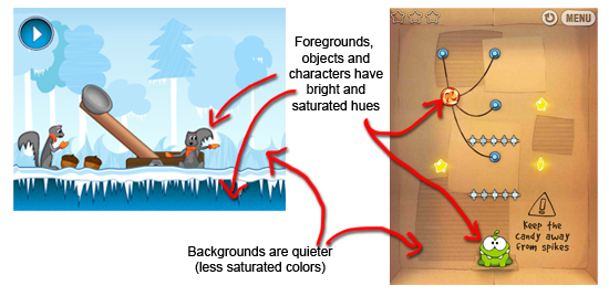
Pictured: Free Catapult Puzzle Set, Free Icy Winter Background, and Cut The Rope
Follow these steps, and you will be well on your way to developing a distinctive style of art for your game. Be creative and explore different options – the best games are unique as well as memorable!
If you have any questions, or more tips, please share them in the comments!


This was very helpful – putting a structure around the many decisions needed.
Very nice post. It seems very simple but it is something I see most game artist missing lately (indie-wise I mean). I have tried to explain the importance of such things to a couple of different people when I needed art and they weren’t quite getting it. Now I can just send them here :)
If only your post could give me the ability to draw I would be set.
Some very good tips. Thank you!
Thanks everyone, glad it was helpful!
@Aaron – lol yes, I wish! But hopefully it will set some of those people with drawing skills on the right path :]
Cool, just got starter kit, will think on that while I design my levels and ships.
Thanks for your blog. It’s full of really useful content. Keep going.
This is a wonderful and tremendously valuable article. Thank you so much for posting this!
Great tutorial :)
Very good tips and tricks for first time game developer like me. Cheers.
Very good article as aways Vicki, thanks. I was wondering about the point of backgrounds being more muted than foregrounds and how to go about achieving this ( I am a beginner ! ) I am not sure if I should be looking at reducing the opacity, increasing the lightness or using a colour overlay with opacity reduced. Any advice would be greatly appreciated.
Jason
Jason – to make the backgrounds more muted, choose colors with lower saturation rather than vibrant hues. Reducing opacity often poses problems when background objects need to be layered over each other.
You can change the saturation of a color by going to the Color palette, clicking the drop-down arrow in the upper right, and choosing HSB. The second slider will be saturation.
Thanks for that Vicki, I have got the hang of it now. I think my perception of what the muted colour should look like was wrong but dropping the saturation is exactly the look that I wanted.
Thanks
Jason
Very good tips! Wondering whether if you could do artwork for my App. Cheers. Kenny
Kenny – Unfortunately I don’t have time to take custom work right now. You can try posting a job on the Concept Art Forums: http://jobs.conceptart.org/
Thanks Vicki!
This was a well written and very useful post. Thanks. Just thought I’d let you know that my Web Game Development professor posted this as something we should all look at.
Thanks Vicki,
I’ve started moving my game’s (in development) artwork towards this style, as I have noticed it is quite a popular style.
Thanks for the advice on the saturation levels between foreground (high) and background (low).
wow thanks alot
i was developing a game design without reading rules but my friend sent to me this link
thanks alooot :)
Great, I’m glad it helped! A few guidelines can make all the difference :]
hi i know that maybe is a stupid question but cut the rope is a game totally in 2d?
Yes, cut the rope is in 2d.
Hi
nice posts! I have artwork I need designed for game! I have an artist he has done a lot of artwork for TV or movies but no Game Art. No If I am building a 2D isometric game same as “Clash of the clans in look” what style does he need to do the artwork? I would appreciate any help please!
scott