Game Design, Tutorials
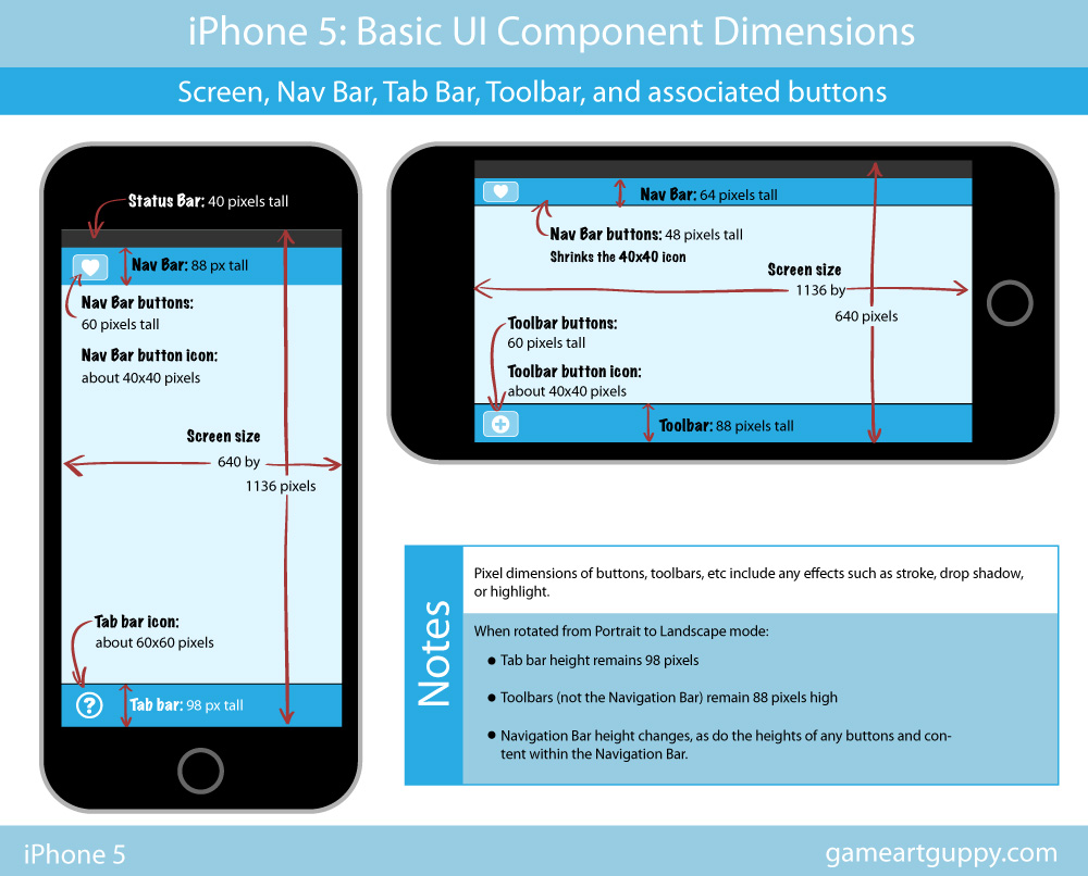
iPhone 5 Basic Screen Component Dimensions
This post first appeared on www.vickiwenderlich.com
For those of you who would prefer a list instead, read on.
iPhone 5 Pixel Dimensions
Note:
- All pixel dimensions include highlight or stroke effects. For example, a 60-pixel high button is actually a 58-pixel high button with a 2-pixel highlight on the bottom.
iPhone 5 screen size:
- Portrait 640×1136 pixels
- Landscape 1136×640 pixels
iPhone 5 Nav bar:
- Portrait: 88 pixels high
- Landscape: 64 pixels high
iPhone 5 Nav bar buttons:
- Portrait: 60 pixels high
- Landscape: 48 pixels high
iPhone 5 Nav bar button icons: about 40×40 pixels (when in Landscape mode, it shrinks the 40×40 pixel icon)
iPhone 5 Toolbar: 88 pixels high (does not change)
iPhone 5 Toolbar button: 60 pixels high (does not change)
iPhone 5 Toolbar button icon: about 40×40 pixels
iPhone 5 Tab Bar: 98 pixels high (does not change)
iPhone Tab Bar icon: about 60×60 pixels


In the landscape image, is the screen size right ? Shouldn’t it be 640 not 960.
Dave
Nice catch Dave – fixed now!
It sounds good ..
Nice! Thansk! XD
hi can you please share for ipad mini also, pls.
Thanks
Good news – the iPad mini screen dimensions are EXACTLY the same as for the regular iPad (nonretina). The mini just has double the resolution, so it fits into a smaller screen. All the dimensions for iPad (nonretina) apply for the iPad mini.
This was very helpful. Trying to design a mobile version of my website to load on smartphones and other portable devices. These specs are the perfect template. Thank you!
This was helpful. Thanks. If you’re designing in InDesign, setting the browser window to 960 x 1365 and zooming out to about 25% (depending on monitor size) gives a fairly close to life size view of the ipPhone5. This gives a decent quick reference during design.
These dimensions are based on the 640 x 1136 screen size minus the status, nav and tab bars. This gives 640 x 960, but my design didn’t look the same in InDesign as on my iPhone5. I found that multiplying by 1.5, for whatever reason, did the trick.
Hi guys,
Thanks for the info. Although I would like to ask a question. What if i have a UI design which does not meet the standards above? For example if my Nav bar is not 88 px height but is 270px? What is wrong in that case?
landscape toolbar is 72px. Portrait toolbar is 88px on iPhone 4/4s and iPhone 5.
Thank you so much for this!
but, what is it in physical terms? ( i’m making my own stencil )
i should add, I dont have an iPhone 5, but when i put vernier calipers against an iPhone 4, the reading is exactly 75mm x 50mm
The official specs for that are 960 x 640px @ 330 ppi, which resolves to 73.89 x 49.26, which isn’t perfectly right.
So naturally i’m hestitant to calculate for 1136 ( or 1096 if my stencil is going to be laser cut for the actual drawing area below the everpresent staus bar )
the ppi seems to be 325, not the quoted 330
The internet is filled with pixel dimensions, which is fine if you’re an artist purely in the digital domain, but useless if you want to work with paper.
does it need to be designed in 300 DPI in photoshop? with that dimensions if for instance i would only like to have it in portrait mode?
thnx
H
DPI only matters in printed materials – it does not matter for screens. The ONLY THING that matters is the total pixels, which is why the dimensions are given in pixels. I hope that helps!
i appreciate you getting back Vicki. i will then develop this in the sizes you mentioned here and then for iphone4 and 4s i would just need to adjust the screen size if i’m correct?
Yep, just adjust the screen size for the 4 and 4s.
i appreciate it. and if i want crisp graphic like i see some people on behance or dribbble with their polished and sharp edges i would need to develop all of this in illustrator right?
You can do this in Photoshop or Illustrator – just be sure to use vectors :]
i appreciate all the help Vicki. thank you very much
Vicki – Can I creat a custom button that is wider than 60px on the tab bar or above the tab bar (main screen)? I need to accomodate a text labels that are wider than 60px.
Also, I need to create a grid of square frames (3 by 4) on the main screen (between rab bar and navigation bar). Would like to make them as large as possible. What dimmensions can I use? User’s will click these frames to add images on the screen.
Thanks,
-DR
Sorry, I’m not a developer – you might check raywenderlich.com to see if his tutorials can help.