Game Design, Tutorials
iPhone & iPad Basic Screen Component Dimensions – Updated For Retina
This post first appeared on www.vickiwenderlich.com
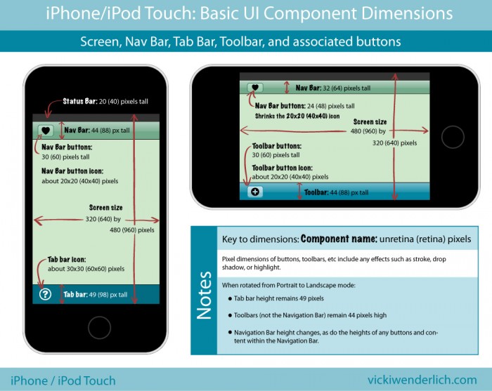
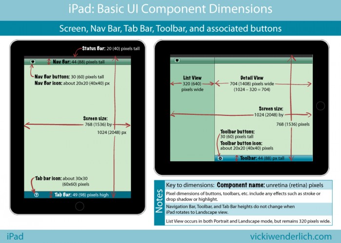
I find myself referring to these all the time when I start on a game or app project! Hopefully they will help you out too. Retina dimensions are in parentheses:


For those of you who would prefer a list instead, read on.
iPhone and iPod Touch Pixel Dimensions
Notes:
- Retina Dimensions are given in parentheses.
- All the dimensions for the iPhone are the same as for the iPod Touch.
- All pixel dimensions include highlight or stroke effects. For example, a 30-pixel high button is actually a 29-pixel high button with a 1-pixel highlight on the bottom.
iPhone screen size:
- Portrait 320×480 (640×960) pixels
- Landscape 480×320 (960×640) pixels
iPhone Nav bar:
- Portrait: 44 (88) pixels high
- Landscape: 32 (64) pixels high
iPhone Nav bar buttons:
- Portrait: 30 (60) pixels high
- Landscape: 24 (48) pixels high
iPhone Nav bar button icons: about 20×20 (40×40) pixels (when in Landscape mode, it shrinks the 20×20 (40×40) pixel icon)
iPhone Toolbar: 44 (88) pixels high (does not change)
iPhone Toolbar button: 30 (60) pixels high (does not change)
iPhone Toolbar button icon: about 20×20 (40×40) pixels
iPhone Tab Bar: 49 (98) pixels high (does not change)
iPhone Tab Bar icon: about 30×30 (60×60) pixels
iPad Pixel Dimensions
iPad screen size:
- Portrait 768×1024 (1536×2048) pixels
- Landscape 1024×768 (2048×1536)
iPad Navigation Bar and Tool Bars: 44 (88) pixels high
iPad Nav Bar and Tool Bar buttons: 30 (60) pixels high
iPad Nav Bar and Tool Bar button icons: about 20×20 (40×40) pixels
iPad Tab Bar: 49 (98) pixels high
iPad Tab Bar icons: about 30×30 (60×60) pixels
iPad List View: 320 (640) pixels wide. This is because when the same app is on the iPhone, the 320 (640) pixel width fits iPhone Portrait mode perfectly.


Thanks for this! I am not a game developer, but I am working with my brother to create an app. These diagrams are very helpful.
You’re welcome – hopefully it saves everyone some time and frustration :]
Its Gng Gud :)
Regards,
Coffee dude
Useful information.!
You have used the word “Toolbar” (not “Tab bar”) when screen mode is changed to landscape from portrait. Why?
Could you please explain what is the difference between “Tool bar” and “Tab bar” in reference to iPhone?
Hi Piyush,
I did this because in the landscape mode I was demonstrating how a toolbar looks on the bottom, rather than a tab bar. They are different.
A toolbar contains controls that perform actions that are relevant to what you see on the screen.
A tab bar lets the user switch between different modes of the app.
You can read more in Apple’s HIG: http://developer.apple.com/library/ios/#documentation/userexperience/conceptual/mobilehig/UIElementGuidelines/UIElementGuidelines.html#//apple_ref/doc/uid/TP40006556-CH13-SW1
Hi Vicki,
Thanks a lot.!!
Link is really informative.
Thanks Vicki, it’s very complete and useful. Since you have almost every aspect of an iOS app measured don’t you think it’s a good idea to also have the dimensions of the icons the app?.
Vicki, thank you for posting this. Its very visual and clear the way you did. I think it would be more useful if you made a PDF or vector file that can be downloaded and used as a template.
Retina iPad height in landscape is 1536 not 1356…..
I believe you made a typo for the iPadHD dimensions, 2048×1356 should be 2048×1536 , however I could be wrong
Yep that was a typo, thanks for pointing it out!
@Paulius – glad it is useful! It isn’t meant to be a template or even completely to-scale, though – just a quick reference when starting projects.
Thanks for this wonderful and helpful collections of information
These diagrams are great! Thank you.
I just started designing for iPhone & iPad apps. I create my artwork in Photoshop, but was wondering: do I save my finished artwork at 300 dpi or 72 dpi? Thank you.
@ejk – it does not matter what resolution you save the art at. It only matters what the overall pixel dimensions are. I usually save at 72 dpi if I have to pick a setting (screen resolution rather than print resolution), but it doesn’t matter.
Thank you Vicki! So brief and so informative. A kind of rare thing nowadays:) A thing to learn from you.
Very useful content for the developers. Thank u so much. It wd be again useful share the pixel information if a iPad application to support both retina (HD) and non retina versions. Does it mean the developer has to provide 2 different pixel sizes for the same image?
It wd be also further useful if u mention on iPad mini pixels which I heard there is no need for a seperate images needed.
Great info. Do you know why if on the iPhone the tab bar and toolbar should both be on the bottom edge, why they have different heights 49 pts vs 44 pts?
looking for some app developers for environmental initiative app- geo-locators, photos- this looked like a good place to start
Thank you for the great cheat sheet… I still have a problem though. The images I create look blurry on the actual test build of iPhone? The DPI is set to 72.. Should this be higher?
Simply its Excellent :)
hi i am web designer and also created started in app design but the design view on in ipad tab bar icons in jaging i design with icon in photoshop design with anti aliyas but the retina view is jaging please inform me how to fix it :)
Incredibly helpful! Thanks so much.
Super helpful…girl you rock!!!
dan
Thankyou so much..
Very good article.
Thank you, very useful information. Especially for starters like me.
Thanks again!
Nice stuff.
Thanks
Very nice if you’re making mockups in Photoshop etc. Thanks for this!
Thank you so much
Very useful for Learners, thanks a lot
Really appreciate this, especially for showing both pts and pixels instead of just pts.
thanks a lot it helped me and my stuff ;)
wish to get other mobiles sizes also ;)
appreciate this
helo there,
Iam very new to iphone design .. soon im going to start designing over iphone application ..plus i have never used any iphone devices..
The thing which is confusing me ..
I want to know what is the difference between retina and non retina . ? ..
Is it necessary to have iPhone device to check live preview ?
And can u please guide me the way to design a design which fits in all iPhone devices 3,3s,4,4s,5…
Hey fadz,
U can refer this for a quick guide: http://www.idev101.com/code/User_Interface/sizes.html
Hope this helps u!!!
This is really awesome calculation. It helps me lot.
Awesome post for iOS developers and designers. Helped me a lot for creating my universal app quickly. Thanks Vicky!
Some days ago I design my http://samtheme.com/ site. I did not follow responsive method. But it was responsive. Some days ago I sow in phone. It is working well.
I have a question that is, we can do this code three time one for tabs one for phone and another for PC. Can we do it. All smart phone screen is same size.
@media only screen and (max-width: … px) {
}
I’m not a programmer – you should head over to raywenderlich.com and check out his tutorials on iPhone development.
I also have another question?
All smart phone like iphone, blackberry and other. And all tabs for all brands are same screen? I need to know it
Good job! :-)
IPhone/ITouch/IPad 5 please :-)