Illustrator, Tutorials
Tutorial: Shading 3-Dimensional Characters With Gradients in Illustrator
This post first appeared on www.vickiwenderlich.com.
This tutorial is to show you how to put into practice the concepts covered in Creating 3-Dimensional Characters & Objects: Light Sources.
When creating a three-dimensional object or character, first you choose where the light source is located, and thus where your light is coming from.
Next, you apply gradients to the object in a particular manner. It is these gradients that give you the three-dimensional feel. Let’s try it out!
We’re going to take the bird to the left and transform it into the bird on the right.
Start by downloading this Illustrator file with the bird’s major shapes already created.
You need to know how to work with gradients and the Pen tool. If you aren’t familiar with those, go through the following tutorials first:
Tutorial: Basic Gradients In Illustrator
Tutorial: How To Use The Pen Tool In Illustrator
The Light Source Dictates Gradient Direction

For this bird, we will choose a light source that is overhead and slightly to the right.Now that you know which direction the light is coming from, apply the gradients with this rule:
Put the lighter color closest to your light source, and the darker color farthest away from your light source.
If the object is spherical, use a radial gradient with the lighter color in the middle, and move the center of the gradient toward the light source (but not all the way to the object’s edge).
If the object is cylindrical, use a linear gradient.
Apply Gradients
Apply Radial Gradient To Bird Body
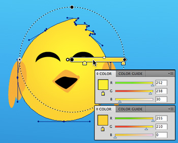
The body is spherical, so we will use a radial gradient. Change the plain yellow fill to a yellow radial gradient that goes from a lighter shade of yellow to a darker, more orange shade.
The middle of the gradient should be in the upper half of the bird’s head, slightly to the right (closer to the light source). Since the gradient is radial, this makes the brightest part of the bird its forehead, which is where the light would hit most strongly in real life.
The gradient changes to a more orangey tone at the outer edge of the circle, and since it is placed off-center, the lower left of the bird (farthest from the light source) is the darkest.
Apply Linear Gradient To Wings
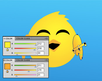
The wings are more cylindrical than they are spherical, so we will use a linear gradient.Click on the fill for the right wing, and change it to a linear gradient as shown. Note that the gradient is diagonal, with the lighter color closest to the light source.
Apply the same gradient to the left wing, adjusting the rotation and length so that it is slightly different from the right wing.
Apply Linear Gradient To Beak
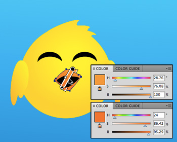
The beak is neither cylindrical nor spherical, so which do we choose?In this case, we will apply a linear gradient so that the top part of the beak is lighter than the bottom part, and we will emphasize the 3-dimensionality of the beak later with a vector highlight.
Click on the fill for the beak, and change it to an orange gradient as shown.
Don’t Overdo It
Notice that all the gradients we used were subtle. We didn’t go from yellow to orange, we went from yellow to yellow-orange. A subtle gradient is all you need, and will look better than a glaring, obvious gradient.
Vector Highlights and Shadows
You can emphasize highlights or shadows by adding vector shapes and filling them with a gradient that is lighter or darker than the object. Think about where the light will hit. Which areas are higher than their surroundings? In our bird’s case, there are three areas: the tops of his cheeks, and the point of his beak.
If you are unsure of where the light would hit on your character or object, look around at physical objects and notice where the colors are brightest.
Make A Beak Highlight
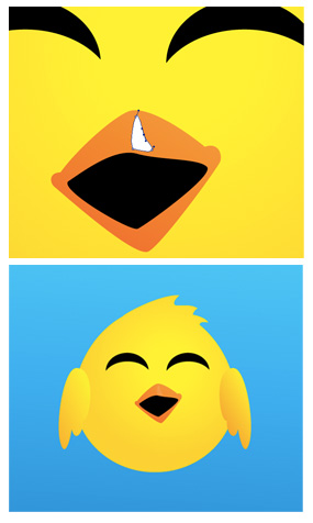
Use the pen tool to create a highlight shape on the beak.The light would hit along the middle of his bill, and a little along the point on the right side.
Fill the shape with white, and lower the opacity to 11%.
Again, subtlety is your friend. The highlight is barely noticeable, but it makes a difference.
Give Each Cheek A Highlight
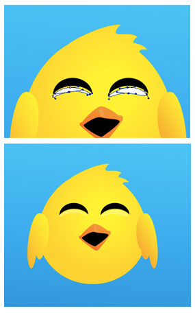
Next, create two highlights underneath the eyes.Follow the curve of the cheeks. When a character smiles, like this bird, their cheeks bunch up and become rounder, like little spheres.
The top of the cheeks, closest to the eyes, is where you want to place the highlights.
Fill each with white and lower the opacity to 41%.
Create A Shadow On The Body
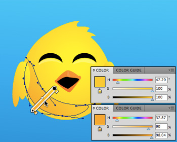
To create the shadow on the bird’s body, we’ll use the pen tool to create a shadow shape.Because it’s a large shadow, we will fill it with a gradient rather than a single color.
As usual, the darkest part of the gradient will be farthest away from the light source.
After creating the shadow shape, move it underneath the left wing in the Layers panel.
The Finished Bird

All right! Now you know how to apply gradients in accordance with the direction of light. This will make your objects and characters appear more three-dimensional.
In the next post, we will cover how to create drop shadows and vector shadow shapes that simulate real-life shadows. These will add to the three-dimensionality and make your objects and characters stand out from the background.
Have any tips to contribute, or questions? Please join in the discussion by leaving a comment!




Awesome! That looks like one Happy Bird to me!
BTW, I saw Ray’s comment on Twitter about 360iDev. Did you guys enjoy it this year? I’m thinking about attending next year.
Yes, we definitely enjoyed it, I would recommend going!