Game Design, Tutorials
5 Tips For Making A Game App Icon
This post first appeared on www.vickiwenderlich.com
When making a game app icon for the first time, many developers are working on a budget and decide to make the icon themselves.

Of course, beginners make rookie mistakes.
These mistakes are very common, but also easily avoided.
I’ve put together this very short list of tips designed to help you create an attractive, eye-catching icon right from the start.
At the end, I will show how these rules apply to one of our own apps, Math Ninja.
We’re focusing on games here – other apps are a whole different beast. With that said, on to the tips!
1. Don’t Use Text
The number one most common rookie mistake is slapping the name of the game all over the icon.
The reason people make this error is due to a fear that the customers won’t know what the game is unless they see the name in the icon. This is completely incorrect.
Remember, the name of the game is below the icon on the iPhone or iPad. The user sees it right there, so having it in the icon is redundant.
Text on an icon just adds clutter. It might look okay at a large size, but when small it looks busy and is hard to read anyway. So remove that text!
2. Use Your Main Character

People associate the game with the main character, so use it! If there are several main characters, choose only one.
Remember, it’s a small icon and the shapes on it need to be instantly recognizable.
To that end, if your character is not small and compact, think about using just the character’s face rather than the whole character.
3. Keep It Simple
Clutter is your enemy. A cluttered icon does not grab the eye – it repels the user. Think: would you like to walk into a messy room or a clean one?Don’t add extra things to the icon. You don’t have to encapsulate everything the game does – you just have to make it attractive and inviting.
Caveat: if you have several games with this main character, you may want to differentiate between them. In this case, you can explore adding a single symbol to the icon (like a “2” for a sequel). But choose carefully, and DO NOT add more than one symbol.
4. Use Contrasting Shades and Colors
So you have your main character and you’ve restrained yourself from adding text or unnecessary items. Now you just need to choose your background.
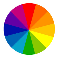
Go for contrast so that your character stands out. If your character is a light color, choose a dark background. If your character is dark, choose a light background.
If it’s a medium color, try out a dark background and a light background and see which provides the best contrast.
One way to make an image pop is to choose a background color that is on the other side of the color wheel from your character color. It doesn’t have to be the opposite color, but it should be on the other half of the wheel. If you want to know why this works, read more here.
Using these tips, if your character is light yellow, you might choose a dark blue background. If your character is red, try yellow or a light blue. If it is black, you have your pick of colors as long as it is a lighter shade.
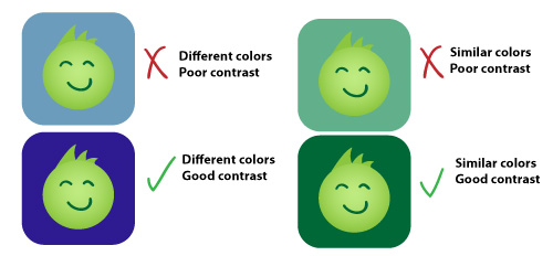
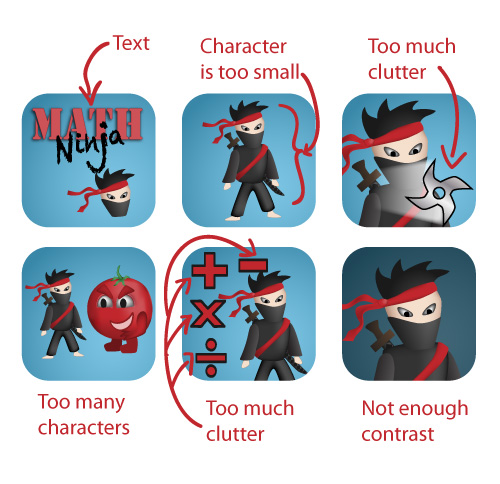
Notice in the above examples how poor contrast muddles the edges of your character. On a small icon, it will look like an amorphous blob. Even though the top left example has pretty colors, the character doesn’t stand out.
Different colors can add interest, but the most important thing is the contrast between the character and the icon background.
5. Remove the Default Gloss

By default, Xcode adds a glossy shine to your icon.
The gloss adds clutter, which as you will recall is our enemy. Take it off.
Let’s Apply These Tips
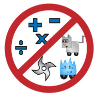
When we went to create the icon for Math Ninja, one of our first apps and our very first game, we tried a lot of things. We basically broke every rule I listed above and then some. Here are some examples of what NOT to do:
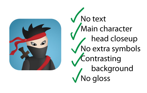
We kept looking at other app icons to see what features made them stand out, which is how we developed this list. Here’s the icon we settled on:
Icon creation is an art form all its own. Great graphic designers can add complexity and subtle touches that will raise the icon from basic to fantastic. But if you could afford to pay for that kind of quality, you probably wouldn’t be reading this list!
Use these tips and be confident that you can make an attractive and memorable icon. If you avoid rookie mistakes by following these tips, your icon will be better than 90% of the icons in the app store!


These are all great pointers for creating a solid icon for your app! Thanks for sharing your lessons learned along the way.
Great Tips.
Thank’s!
Hi Vicki Wenderlich,
Thank you so much for posting the articles to your website.
I certainly will be looking at your tips over the weekend.
Regards,
Jason
I love it!!! I will definitely be using this!
But let me say that there are a few games that have the name of the game on their icon that have done tremendously well, and are made by big name companies, such as Dead Space, or Mass Effect. In face, not that i think of it, the majority of Electronic Arts’ games have the name of the game on them! Maybe that’s just their think :p. But there is also Call of Duty Zombies that uses this. The Skylanders Cloud Patrol uses it. But I definitely see what you mean, because about 95% of the apps on my iTouch dont have text on the icon.
Hello, thank you for this tutorial,
May I ask you to make a tutorial on creating customized pins for maps that can be applied for apps with maps showing multiple locations required (both coffee houses and restaurants) or people from the same group (different university students).
Thank you
Thanks for the idea! I’ll look into that.
nice article!
thanks
nice one,,, it is helpful for new designer…
thnx for the idea! remove the gloss lol. . >:DD
Great article. Do you make game apps.